
안녕하세요!
오늘은 파이썬 matplotlib라이브러리를 이용해 다양한 종류의 그래프를 만들어 보도록 하겠습니다.
그럼 바로 시작해 보도록 하겠습니다.
데이터 준비
오늘 시각화할 데이터는 kaggle의 'Customer Personality Analysis' Datasets를 이용하여 그래프를 시각화 해보겠습니다.
아래의 링크에서 csv파일을 다운받아 주세요:)
https://www.kaggle.com/imakash3011/customer-personality-analysis
Customer Personality Analysis
Analysis of company's ideal customers
www.kaggle.com
이 데이터는 한 회사 고객들의 구매 정보 및 고객 정보등을 포함하고 있습니다.
각 열의 내용은 아래와 같습니다.
People
ID: Customer's unique identifier (고객식별id)
Year_Birth: Customer's birth year (출생년도)
Education: Customer's education level (학력)
Marital_Status: Customer's marital status (결혼상태)
Income: Customer's yearly household income (수입)
Kidhome: Number of children in customer's household (자녀 수)
Teenhome: Number of teenagers in customer's household (10대 자녀 수)
Dt_Customer: Date of customer's enrollment with the company (회원가입날짜)
Recency: Number of days since customer's last purchase (마지막구매 후 경과일자)
Complain: 1 if the customer complained in the last 2 years, 0 otherwise (지난 2년간 컴플레인 여부)
Products
MntWines: Amount spent on wine in last 2 years (지난 2년간 와인 구매량)
MntFruits: Amount spent on fruits in last 2 years (지난 2년간 과일 구매량)
MntMeatProducts: Amount spent on meat in last 2 years (지난 2년간 육류 구매량)
MntFishProducts: Amount spent on fish in last 2 years (지난 2년간 수산물 구매량)
MntSweetProducts: Amount spent on sweets in last 2 years (지난 2년간 간식류 구매량)
MntGoldProds: Amount spent on gold in last 2 years (지난 2년간 귀금속 구매량)
그 밖에도 여러 열이 있는데 나머지는 위의 링크에 들어가면 확인할 수 있습니다 :)
필요모듈 import 및 폰트설정
오늘의 주인공이자 그래프 생성에 필요한 matplotlib 라이브러리와
데이터 불러오는 데 필요한 pandas 라이브러리를 불러와 줍니다.
그리고 그래프에 한글을 사용하기 위해서 한글 폰트를 설정해 주어야 하기 때문에 폰트설정까지 해 보도록 하겠습니다.
import pandas as pd
import matplotlib.pyplot as plt
from matplotlib import font_manager,rc

# 한글 폰트 설정
font_location = 'C:/Windows/Fonts/MALGUNSL.TTF' #맑은고딕
font_name = font_manager.FontProperties(fname=font_location).get_name()
rc('font',family=font_name)
저는 '맑은 고딕'을 한글 폰트로 사용하겠습니다.
다른 폰트를 사용하고 싶다면 변경해 주시면 됩니다.
데이터셋 준비
위에서 다운받은 csv파일을 열어 줍니다.
이 csv파일은 ,가 아니라 tab으로 나누어져있어 sep = \t으로 설정하여 열어주어야 합니다.
그후 .head()를 사용하여 데이터 내용을 확인해 보도록 하겠습니다.
#데이터 셋 불러오기
df = pd.read_csv('marketing_campaign.csv',sep='\t')

print(df.head())
출력:

29개의 컬럼으로 데이터가 이루어져 있습니다.
각각 컬럼에 대한 설명은 위를 확인해 주세요.
이제 위의 데이터로 그래프를 만들어 보도록 하겠습니다.
히스토그램 그래프
히스토그램은 도수분포를 그래프화 시킨 건데 보통 변수 1개를 가지고 빈도를 구하여 그래프를 그립니다.
오늘 포스팅에는 고객의 자녀 수를 히스토그램으로 만들어 보도록 하겠습니다.
#############히스토그램##############
#그래프를 그리기 위한 기본 틀 생성
fig = plt.figure()
axes1=fig.add_subplot(1,1,1)

#히스토그램 그래프 만들기(변수1개)
axes1.hist(df['Kidhome'],bins = 8) #가정의 자녀 수 히스토그램 #bins는 x축 칸(간격)조정
#제목설정
axes1.set_title('고객 가정의 자녀 수 히스토그램')
#x축라벨링
axes1.set_xlabel('자녀 수')
#y축라벨링
axes1.set_ylabel('빈도')
plt.show()
위와 같이 히스토그램이 만들어 졌습니다.
데이터프레임으로도 히스토그램을 만들 수 있는데요 방법은 아래와 같습니다.
###다른방법으로 히스토그램
ax = plt.subplots()
ax = df['Kidhome'].plot.hist()
plt.show()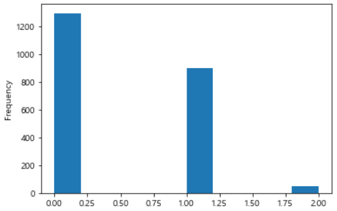
산점도 그리기
이번에는 matplotlib으로 산점도를 생성해보도록 하겠습니다.
산점도는 x,y 값을 점으로 찍어 그래프를 그리는방법인데,
여기서는 간식구매량을 x, 과일구매량을 y로 설정하여 산점도를 생성해 보겠습니다.
#산점도 그리기(변수2개)
scatter_plot = plt.figure()
axes2 = scatter_plot.add_subplot(1,1,1)

axes2.scatter(df['MntSweetProducts'],df['MntFruits'])
#제목설정
axes2.set_title('간식구매량 및 과일구매량 산점도')
#x축라벨링
axes2.set_xlabel('간식구매량')
#y축라벨링
axes2.set_ylabel('과일구매량')

#산점도 그리는 다른 방법
fig2,ax2 = plt.subplots()
ax2 = df.plot.scatter(x='MntSweetProducts',y='MntFruits',ax=ax2)
plt.show()
[산점도 그래프]

[df로 그린 산점도 그래프]
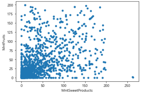
이렇게 2가지 방법으로 산점도를 그려 봤습니다.
박스그래프
이제 박스그래프를 그려보도록 하겠습니다.
박스그래프는 이산형 변수와 연속형 변수를 함께 사용하여 그리는데
이산형 변수는 성별의 male, female 과 같이 확실히 구분되는 값을 말하고,
연속형 변수는 구매량과 같은 연속적인 숫자가 있는 범위의 값을 말합니다.
이번에는 데이터의 Education(학력)을 이산형변수로,
Income(수입)을 연속형 변수로 하여 박스그래프를 그려 보도록 하겠습니다.
income값 중에 null인 값이 있어 null을 0으로 대체한 후 그래프를 생성하도록 합니다.
#############박스그래프##############
# box 그래프 그리기(이산형 변수와 연속형 변수를 함께 사용)
# 이산형: 학력
# 연속형: 수입
# df Null값 0으로 대체
df['Income'] = df['Income'].fillna(0)

boxplot = plt.figure()
axes3 = boxplot.add_subplot(1,1,1)
axes3.boxplot([df[df['Education'] == 'Basic']['Income'],
               df[df['Education'] == 'Graduation']['Income'],
               df[df['Education'] == '2n Cycle']['Income'],
               df[df['Education'] == 'Master']['Income'],
               df[df['Education'] == 'PhD']['Income']],
               labels=['고졸','대졸','2nCycle','석사','박사'])

axes3.set_xlabel('학력')
axes3.set_ylabel('수입')
axes3.set_title('학력에 따른 수입 박스그래프')
plt.show()
여기서 Basic은 고등학교 졸업, Graduation은 학사, Master은 석사, PhD는 박사를 의미합니다.
2nCycle(second cycle)은 학사~석사 라고 하는데 석사 과정에 있는 사람을 말하는 것 같습니다.
혹시 2nCycle에대해 아는 분들은 댓글 남겨주세요 ㅎㅎ
그리고 df로도 박스 그래프를 그릴 수 있는데요 그전에 기존df의 피벗팅이 필요합니다.
아래와 같이 필요한 내용만 데이터를 뽑아 주세요.
# df피벗
#교육, 수입부분만뽑기
df_pv=df.iloc[:,0:5]
df_pv = df_pv.drop(['Year_Birth','Marital_Status'],axis=1) #열삭제시 axis=1
print(df_pv.head())
출력:

그 후 피벗을 진행해 줍니다.
#교육상태를 컬럼으로 피벗
df_pv = df_pv.pivot_table(
    index='ID',
    columns='Education',
    values='Income')
print(df_pv.head())
출력:
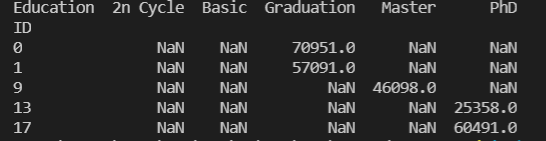
이제 다시 박스 그래프로 시각화 해보도록 하겠습니다.
#df로 박스그래프 만들기
fig3,ax3 = plt.subplots()
ax3 = df_pv.plot.box(ax= ax3)
plt.show()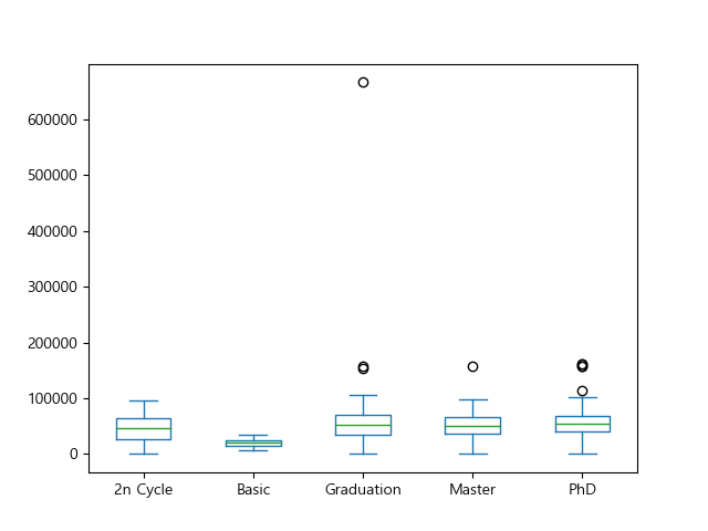
위와 같이 그래프가 잘 만들어졌습니다. ㅎㅎ
전체 코드
import pandas as pd
import matplotlib.pyplot as plt
from matplotlib import font_manager,rc

# 한글 폰트 설정
font_location = 'C:/Windows/Fonts/MALGUNSL.TTF' #맑은고딕
font_name = font_manager.FontProperties(fname=font_location).get_name()
rc('font',family=font_name)
#데이터 셋 불러오기
df = pd.read_csv('marketing_campaign.csv',sep='\t')

print(df.head())

#############히스토그램##############
#그래프를 그리기 위한 기본 틀 생성
fig = plt.figure()
axes1=fig.add_subplot(1,1,1)

#히스토그램 그래프 만들기(변수1개)
axes1.hist(df['Kidhome'],bins = 8) #가정의 자녀 수 히스토그램 #bins는 x축 칸(간격)조정
#제목설정
axes1.set_title('고객 가정의 자녀 수 히스토그램')
#x축라벨링
axes1.set_xlabel('자녀 수')
#y축라벨링
axes1.set_ylabel('빈도')
#plt.show()

###다른방법으로 히스토그램
ax = plt.subplots()
ax = df['Kidhome'].plot.hist()
#plt.show()

#############산점도##############
#산점도 그리기(변수2개)
scatter_plot = plt.figure()
axes2 = scatter_plot.add_subplot(1,1,1)

axes2.scatter(df['MntSweetProducts'],df['MntFruits'])
#제목설정
axes2.set_title('간식구매량 및 과일구매량 산점도')
#x축라벨링
axes2.set_xlabel('간식구매량')
#y축라벨링
axes2.set_ylabel('과일구매량')


#산점도 그리는 다른 방법
fig2,ax2 = plt.subplots()
ax2 = df.plot.scatter(x='MntSweetProducts',y='MntFruits',ax=ax2)
#plt.show()

#############박스그래프##############
# box 그래프 그리기(이산형 변수와 연속형 변수를 함께 사용)
# 이산형: 학력
# 연속형: 수입
# df Null값 0으로 대체
df['Income'] = df['Income'].fillna(0)

boxplot = plt.figure()
axes3 = boxplot.add_subplot(1,1,1)
axes3.boxplot([df[df['Education'] == 'Basic']['Income'],
               df[df['Education'] == 'Graduation']['Income'],
               df[df['Education'] == '2n Cycle']['Income'],
               df[df['Education'] == 'Master']['Income'],
               df[df['Education'] == 'PhD']['Income']],
               labels=['고졸','대졸','2nCycle','석사','박사'])

axes3.set_xlabel('학력')
axes3.set_ylabel('수입')
axes3.set_title('학력에 따른 수입 박스그래프')
#plt.show()

#df으로 box plot 그리기

# df피벗
#교육, 수입부분만뽑기
df_pv=df.iloc[:,0:5]
df_pv = df_pv.drop(['Year_Birth','Marital_Status'],axis=1) #열삭제시 axis=1
print(df_pv.head())

#교육상태를 컬럼으로 피벗
df_pv = df_pv.pivot_table(
    index='ID',
    columns='Education',
    values='Income')
print(df_pv.head())

fig3,ax3 = plt.subplots()
ax3 = df_pv.plot.box(ax= ax3)
plt.show()
코드파일
참고자료
- 책 Do it! 데이터 분석을 위한 판다스 입문 - 이지스퍼블리싱
마무리
오늘은 matplotlib로 그래프 그리는 방법을 알아보았는데요
다음 시간에는 matplotlib 2편으로 다른 그래프들도 그려보도록 하겠습니다!
궁금한 점은 댓글로 알려주세요:)
++ 파이그래프 추가한 글은 아래에서 확인하실 수 있습니다.
https://wonhwa1.blogspot.com/2022/11/python-matplotlib.html
[python] matplotlib으로 그래프 만들기- 히스토그램, 산점도, 박스그래프, 파이그래프
Matplotlib이란? matplotlib은 python에서 데이터 시각화를 도와주는 라이브러리입니다. 그럼 matplotlib을 이용해 다양한 종류의 그래프를 바로 그려 보도록 하겠습니다. 데이터 준비 오늘 시각화할 데이
wonhwa1.blogspot.com
'시각화(Visualization)' 카테고리의 다른 글
| [python/시각화] seaborn으로 그래프 그리기 (0) | 2021.12.20 |
|---|---|
| [python/시각화] matplotlib으로 그래프 만들기- 다변량그래프, 밀집도그래프, 육각그래프 (0) | 2021.12.15 |
| [python] CCTV,가로등 위치를 folium을 사용하여 clustering 시각화하기 (4) | 2021.11.17 |
| [python] folium을 이용하여 CCTV 위치 시각화하기 (3) | 2021.11.15 |
| [python] 네이버 블로그 크롤링 결과로 WordCloud 시각화하기 (5) | 2021.11.10 |